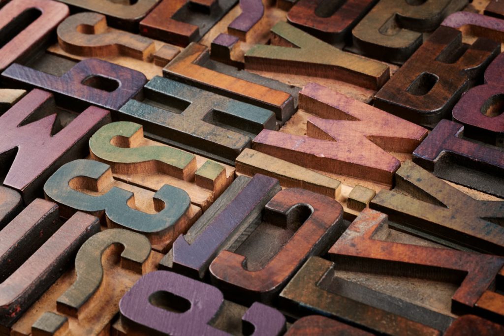
Typography is the art and technique of arranging type to make written language readable, appealing, and visually consistent. It is a vital component of web design, as it determines how the text looks on a webpage. Good typography makes web content easy to read and helps to create a positive user experience and a more successful website.
When talking about web typography, you are referring to the use of fonts on the World Wide Web. When HTML was created, font styles and sizes were controlled by the web browser’s own settings.
Then, a few years later CSS was created which allowed programmers to change the style of their website fonts.
Why Is Typography Important?
Typography is one of the most important aspects of web design, as it plays a vital role in readability and legibility. In order to create a positive user experience, it is essential that web designers choose appropriate fonts and font sizes that will make web content easy to read.
In web design, typography counts for about 95% of the design. Features such as font family, font length and size as well as the hierarchy of the fonts allow users to navigate through the site a lot easier.
Typography has a big influence on how information is absorbed and comprehended by visitors to a website.
How Does Typography Affect Web Design?
The choice of font and font size can have a significant impact on the overall look and feel of a website. Fonts that are too small or difficult to read can make it hard for users to consume content, which can negatively affect their experience.
Similarly, using too many fonts or using excessively large or decorative fonts can also be detrimental to the overall design. As well to this font weights and line height play a huge part in the design of your website.
What Are the Best Practices for Typography in Web Design?
Fonts are one of the most important aspects of web design, as they can have a significant impact on the overall look and feel of your website. When choosing a font, it is important to follow some best practices in order to create a website that is easy to read and visually appealing. When it comes to choosing fonts, at Freedom Search, we follow certain steps.
Use Two Different Fonts
When it comes to typography, using multiple fonts can be a great way to add visual interest to a website. It is always a good idea to use multiple fonts for different purposes. For example, Your heading fonts might match whereas for your main text you might have a different font family. In addition to this, you may also have a slightly different font variation for links within your text.
Using one font for everything is not a good idea as more than one has many more benefits. Firstly, it allows users to scan and read your text meaning they are more likely to stay on your website for longer. They will be able to scan your text because they can easily identify headings as opposed to paragraphs.
You should also understand that using more than 3 fonts can very quickly become messy if you do not get the styling correct.
It’s important to know that you should find different font styles which look well together. There are many ways you can do this, but the main one is to look at other related websites and see what font they are using.
Use Font Sizes that are Easy to Read
Small fonts can have a negative effect on web design because they can be difficult to read. This can cause visitors to leave your website without taking any action, which can impact your business. Additionally, small fonts can be difficult to design and format, which can lead to an unprofessional look for your website.
Small font sizes can also have a negative effect on SEO. When text is too small to read, users are likely to abandon the page, which can hurt a website’s ranking in search engines and increase its bounce rate, which is bad.
Use Line Heights that are Comfortable to Read
When it comes to line height, it is important to use a size that is comfortable to read. If line heights are too small, they can make text difficult to read, which can negatively affect the user experience. In addition, using excessively large line heights can also be detrimental to the overall design of a website.
Your line height should be one of the last things you do when creating your typography. Therefore, you can have a bit of trial and error to see which looks the best with your other typography factors.
Use Typography to Create a Visual Hierarchy
Typography can be used to create a visual hierarchy, which is essential for making web content easy to scan and read. By using different fonts and font sizes, you can highlight the most important information and make it easier for users to find what they’re looking for.
For example, your heading tags might be the same font family as each other but for the different ones, i.e H1, H2 H3, H4, H5, H6, you might have slightly smaller sizes as you go down the ladder.
White Space
Many people think that the less white space visible on a website the better. However, that statement is not entirely true. White space has a range of benefits in web design.
One of the most important benefits of white space is that it can make web pages easier to read. When there is a lot of text on a page, it can be difficult for users to find the information they are looking for. By adding more white space around the text, you can make it easier for users to scan and read your content.
In addition to making content more readable, white space can also make websites more visually appealing. When used effectively, white space can add balance and harmony to a design.
Alignment
While alignment is more of a design feature, it still falls under the category of typography. It’s important because if your content does not follow an alignment style, it can look messy and unprofessional. You should take care when aligning text as it can have a big impact on the overall look of your website.
There are three main types of alignment: left, right and centre.
Left-aligned text is the most commonly used type of alignment. It is easy to read and looks good with most fonts.
Right-aligned text can be more difficult to read but can be used to create a more formal look for your website.
Centre-aligned text can be used for headings or short paragraphs of text. It is important to note that centre-aligned text should only be used sparingly as it can be difficult to read.
Conclusion
Web designers should carefully consider the use of typography in their designs. Typography can be used to create a visual hierarchy, make the text easier to read and add balance and harmony to a design.
Additionally, web designers should pay attention to the use of white space and alignment in their designs. White space can make pages easier to read, while alignment can help content look neater and more professional. Contact Freedom Search today for more information on our web design service.


