
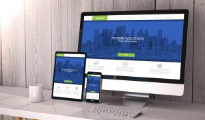
Before exploring the benefits of responsive websites and mobile design, let’s first look at what it is all about. In 2010, a web designer, Ethan Marcotte, coined the term Responsive Web Design or RWD. He told other designers that the future was nearly on the doorstep and that website design needed to be ready to explore all the new possibilities. Responsive websites are about getting your websites to reach more people and use devices other than laptops. A responsive website design is a liquid, flexible layout that adapts to different screen sizes and resolutions of different devices. Responsive websites allow your website content to adapt and scale across all platforms.
The earlier website designs were about making more than one of the same website designs compatible with smartphones and tablets. Users already wanted to access websites via their blackberry, Apple and Android devices, all with different-sized screens. Meaning a lot more work for designers and consequently adding more costs for companies. Plus, maintenance was harder and costlier for all the sites on the different devices. In addition, more and more businesses wanted a streamlined approach between their websites on various devices. As many of them move on to a Multi-channel or Omni channel marketing strategy, a powerful responsive website is essential.
In 2021 97% of internet users used mobile devices to go online. This is the number that businesses and companies need to be aware of to make necessary changes. If you don’t have a responsive website with a mobile design, then now is the time to get one.
Differences Between Responsive Websites & Adaptive Design
Adaptive design or Graphic User Interface, also known as GUI, is a design type that adapts to different screen sizes. This typically is about using a fixed, multiple layout size where the system detecting them opens the appropriately sized browser.
Content in an adaptive design follows a fixed layout, meaning the system selects the best of the fixed layouts to suit the screen. It is common practice for designers to develop designs for the six-screen widths in common uses – 320, 480, 960, 1200 and 1600 pixels. Doing this allows the designer to optimise each design to its size. The downside of designing like this is the expense. In addition, if a user doesn’t have a typical screen size, he’s out of luck!
Content flows dynamically in responsive website designs, using a single layout that can resize according to the screen size.
What Makes A Responsive Website?
There are three features that a responsive web design requires.
Flexible Visuals
This is about keeping rich files within the confines of their containers and viewports, resizing the visual container and the visual itself.
Media Queries
Cascading Style Sheets – CSS is the cornerstone of responsive website designs. CSS coding allows content to adapt to different conditions.
Fluid Grids
These put the control into the hands of the users. Grids, made with CSS, allow columns to rearrange automatically. Making the website design contant over every device. An action that allows designers to work on one site, not multiple ones, thereby saving money and time.
Benefits Of A Responsive Website For Businesses
Your customers will love a website that allows them to view in a consistent way whatever they want on your site. No more annoying discrepancies between mobile and a website designed for a computer screen.
For businesses that want to connect, personalisation is a key point, and having a responsive website is necessary if businesses want multi-channel marketing to succeed. This means optimising their websites for all devices—and the ones to come—if companies want to facilitate unified customer profiles and drive real-time relevant interactions.
Responsive design websites load quickly, without distortion allowing users quick access to the info they are looking for great for B2B and B2C companies.
Another big plus for responsive website is the search engine really like them—aka Google—is geared toward mobile optimised sites. This results in more traffic to your site, lower bounce rates and an improved user base.
Brief Overview Of RWD Benefits.
- Lower costs
- Easy to maintain
- Like on any device, it engages your customers and potential ones to remain with the site.
- Being able to create a personalised colour chart
- A personalised website
- Quickly redesign a responsive website to include time-limited events and promotions
- Sites load quicker
- For omnichannel & multi-channel marketing, a responsive website is essential.
- You can update an older website by using CSS coding.
The future Ethan Marcotte talked about is here, now, and you need to act to stay competitive. He also pointed out that responsive website design needs to evolve beyond our current devices. Smartwatches, for instance. Responsive websites need dwell-planned designs and small, reusable modules to reach every device and person.
Interested in learning more about responsive websites and how we can help maintain your internet presence for now and the future of your business. Give us a call, and let’s talk.


